Cases
Boostmi


$5.3B
market size in North America in 2020
$6.63B
projected reach by 2026
3.66%
growing at a compound annual growth rate
No easy and consistent Roadside Assistance services
There's a lack of consistent service delivery across regions and providers, and integrating efficient communication, payment, real-time updates and quality control systems into one platform.
Intro
Boostmi aimed to revolutionize the roadside assistance experience by offering a comprehensive end-to-end platform that supports drivers, providers, and fleet managers. Their ambition was to enhance roadside assistance through scalable technology, transforming it into an integrated and seamless process. The company had great ideas, but they lacked cohesive user flows, scalable platforms, and a consistent brand identity.
As the Lead Product Designer, my role was to bring clarity to their user journey, create intuitive and scalable design solutions, and align their brand across all platforms. I was responsible for problem definition, design exploration, user research, planning, validation and leading the design efforts for both web & mobile applications.


Overview
Boostmi is a company with great ambitions for what roadside assistance should be. End to end, from the drivers, providers and different companies that manage fleets of providers.
When I met the Boostmi team they had a lot of great ideas, with some mobile apps, web apps, and the basics of a brand.
First steps
We initiated our design strategy by identifying various user segments and tailoring our approach to meet their specific needs.
With an understanding of diverse personas and interactions, we began outlining the foundational elements of our platform.
Different Users
The challenge was to understand and map every goal, translate them into a system of flows that interact simply and smoothly :
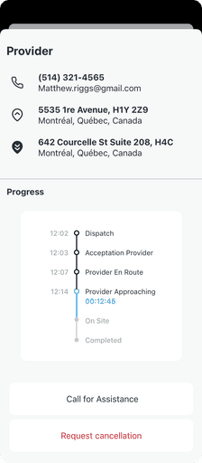
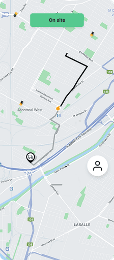
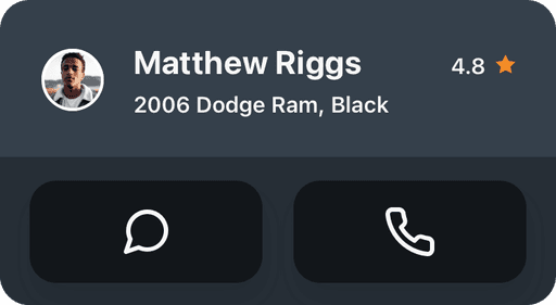
The service requests
Drivers
Boosters – Peer to peer
Professional providers
Dispatchers
Admins
Business clients
The Platform
The Software as a Service, etc

Process
We started by identifying the core user personas and mapping out the interactions and needs for each: drivers, peer-to-peer providers (Boosters), professional providers, dispatchers, admins, and business clients.
Our design process followed the Atomic Design methodology, breaking down UI components into atoms, molecules, and organisms to build a flexible design system. We conducted user research and ideation sessions to understand user needs, followed by wireframing and prototyping. The design system was continuously tested with users through usability tests, leading to iterative refinements.

Scalability
As part of the process I sketched and tried many approaches to build different layouts restricting myself and team to the basics UI elements.
After several tries and plenty improvements. It worked! We were able stretch our basic components: palette and icons to build apps that felt unique BUT under the umbrella of a main brand.
Design, Build, Test, Improve
We prioritized user-centric design for the Boostmi Platform to meet diverse user needs.
We meticulously mapped out user personas and interactions, the User Tested the different journeys to improve it.
Our design system ensured seamless experiences across platforms, fostering flexibility and scalability.

Solutions
The solutions were focused on scalability and flexibility:
Design System
We created a modular design system using Atomic Design principles. This allowed us to build and customize components very quickly for the different platforms while maintaining brand consistency.
PWAs for Scalability
The web apps for admins and dispatchers were designed as Progressive Web Applications (PWAs), allowing Boostmi to scale these into SaaS products and potentially offer white-label services for other businesses.
User-Centric Mobile Apps
The Boostmi app for drivers and the provider app for Boosters and professional providers were designed with the user’s environment in mind, using native patterns for iOS and Android, ensuring a seamless and intuitive user experience.
Collaboration
Collaboration was key throughout the Boostmi project. I worked closely with the development team and the CTO to prioritize design efforts in alignment with business and market changes. This close collaboration helped ensure that the design system was implemented as intended, while also adapting to technical constraints as they arose. Regular workshops with stakeholders allowed us to stay aligned on the product vision and shifting priorities. Cross-functional collaboration extended to the marketing team, ensuring that the brand identity was consistently represented across all digital platforms, marketing assets, and printed materials.
We adopted an Agile development methodology, enabling us to iterate quickly based on feedback, meet evolving business needs, and keep the platform improving through ongoing user insights.


Impact and Outcomes
The Boostmi platform experienced significant improvements in terms of user satisfaction and operational efficiency. The design system allowed the team to develop features quickly, test ideas, and pivot when necessary. The modular design components helped scale the platform while maintaining a consistent brand identity.
User flows were validated through rigorous testing and real feedback, leading to iterative improvements. By showcasing the platform to investors, Boostmi could provide transparent insights into its potential, securing more confidence from stakeholders.
Key outcomes included:
Improved onboarding for drivers and providers.
Streamlined service request and dispatch processes.
Increased scalability for the Boostmi platform with the potential to offer white-label services.


Atomic Design
With a basic but flexible approach, we started wireframing and converting our flows into ideas, ideas into wireframes, wireframes into discussions, later on they became ATOMIC.
I used the atomic design principles to define our Atoms, Molecules, and Organisms to build consistency and cohesivity across the broad spectrum of flows.
PWA Navigation and icons (atoms)
Our baby 👶 Atomic Design System let us put together our first interfaces and the dev team started to build.

PWA Navigation for different users. And custom branded icons.

Atoms, molecules and organisms – Atomic Design


As a product designer, one motivation lies in crafting assets that maintain a cohesive brand identity across all touchpoints within the company. This involves ensuring that products, visuals, and printed materials align seamlessly with Boostmi's brand guidelines. Additionally, your my extended to creating various marketing assets such as souvenirs, presentations, pitches, and emails, all of which contribute to reinforcing the company's brand consistency and message.
I designed and built a multi language, responsive website (boostmi.com) using Webflow. Including 3 main sections “For Drivers”, “For Business” and “Blog”
Using the no-code approach of Webflow was a super experience, designing and building let designers obtain and stretch to the maximum the web as a technology.
Branding and Marketing

Web design and integration – Webflow

Agile Development
In designing Boostmi, we adopted an agile development methodology, enabling us to respond promptly to changing business and partners requirements and stakeholder expectations. This approach facilitated rapid quality assurance, allowing for swift iterations and ongoing enhancements to the platform.
Optimise for Angular
To optimize the development of apps running on web and native iOS and Android platforms, we capitalized on the team's robust knowledge of AngularJS. By leveraging their expertise in AngularJS, we built scalable, high-performance interfaces that prioritize usability and maintainability, ensuring a seamless user experience across devices.
Collaborative Process
Our design process was characterized by close collaboration among designers, developers, and stakeholders. By fostering a collaborative environment, we ensured alignment on project objectives, facilitated efficient iteration cycles, and leveraged the diverse expertise of each team member to achieve optimal outcomes.

Bookmark – Print

Presentation Assets - Customizable presentations as a system.

Souvenirs – brand gear
Conclusion
The Boostmi project allowed me to bring together my skills in user research, design system creation, and cross-functional collaboration to deliver a scalable, user-friendly platform. The iterative design process ensured continuous improvements and allowed the product to evolve with user needs.
This project taught me the importance of designing with scalability in mind, particularly when dealing with a diverse range of users and platforms. It also reinforced my belief in the power of collaboration and user feedback to drive successful product design.

Low res wireframes – Dashboard, Admin contracts and Providers

Low res wireframes – Accept a Service Request, Provider

Low res wireframes – Request a Service


